WHOLE Festival
2024 Edition
Credits
- Creative Direction & Web Design Nicola Napoli
- 3D Model Liam Schnell
- Graphic Design Eduardo Rodarte
- Video Animation Julie Goslinga
- Logo Animation Roy Sturdy
After the big success of the 2023 edition, I had the pleasure to take care one more time of the creative direction and design for WHOLE Festival 2024.
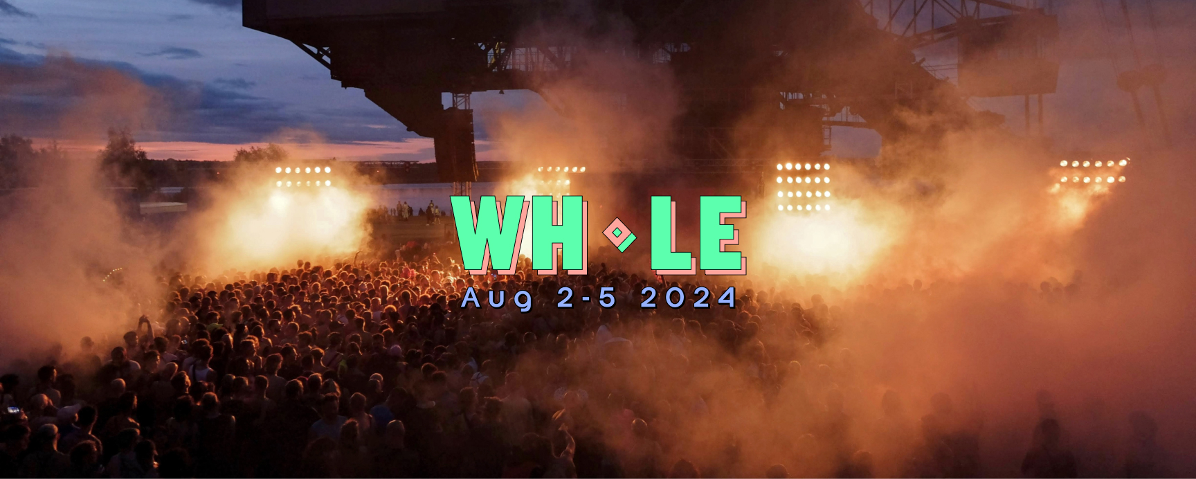
Now at its sixth edition, WHOLE began back in 2017 seeking to connect music collectives from all over the globe under one banner of creativity, passion, pleasure, and above all, good music. Over three full days of camping, DJ sets, workshops, art installations, film screenings and local food vendors, the festival brings together a program of dozens of local and international artists, representing the best in electronic music. The festival take place at Ferropolis, a lakeside industrial park a few hours outside of Berlin.
‘Shall we play?’
Campaign concept
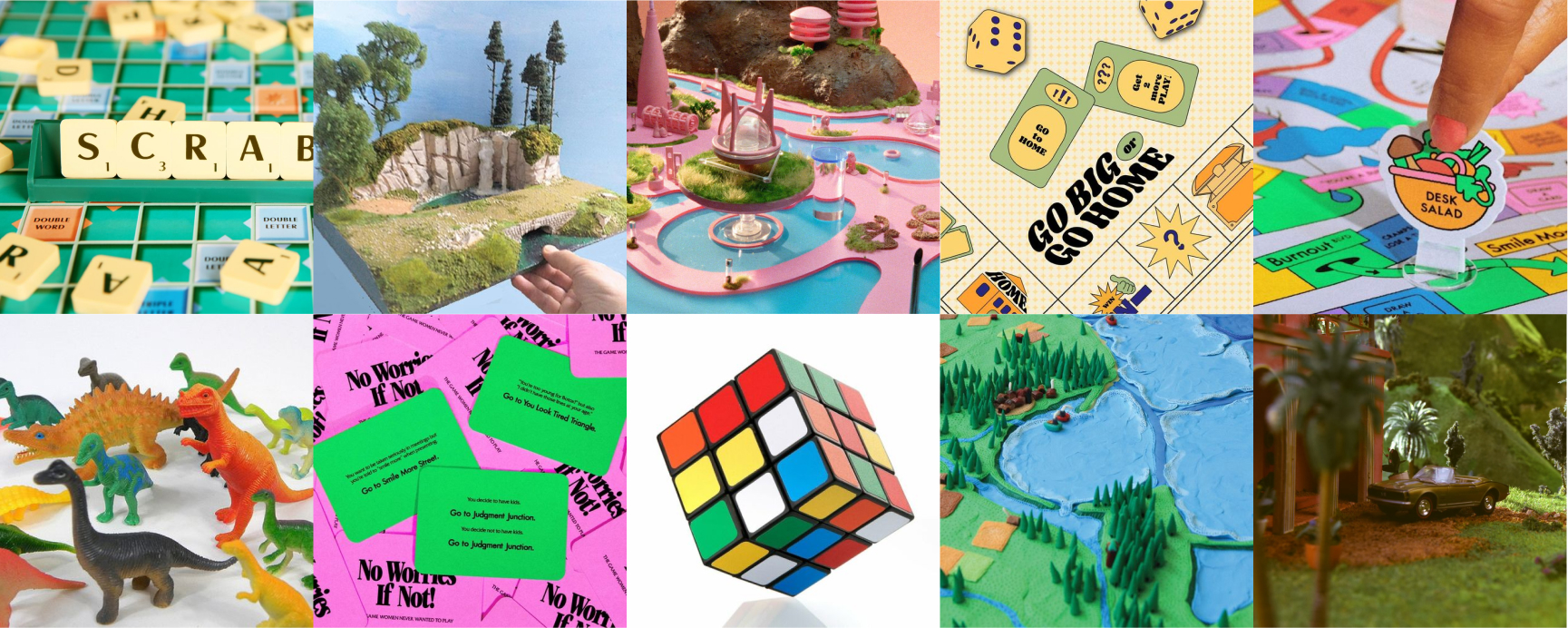
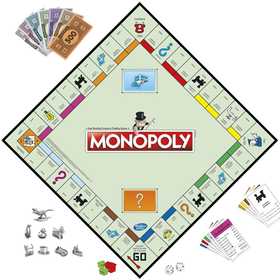
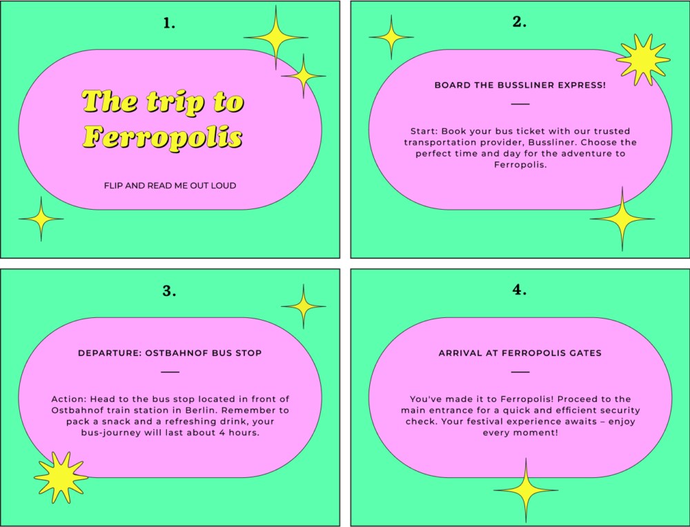
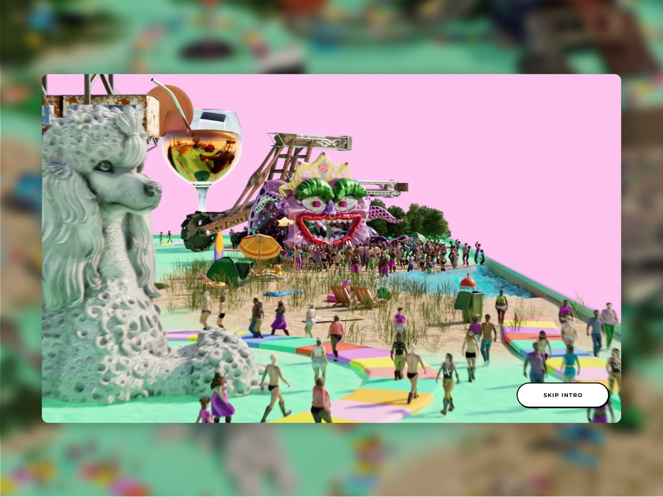
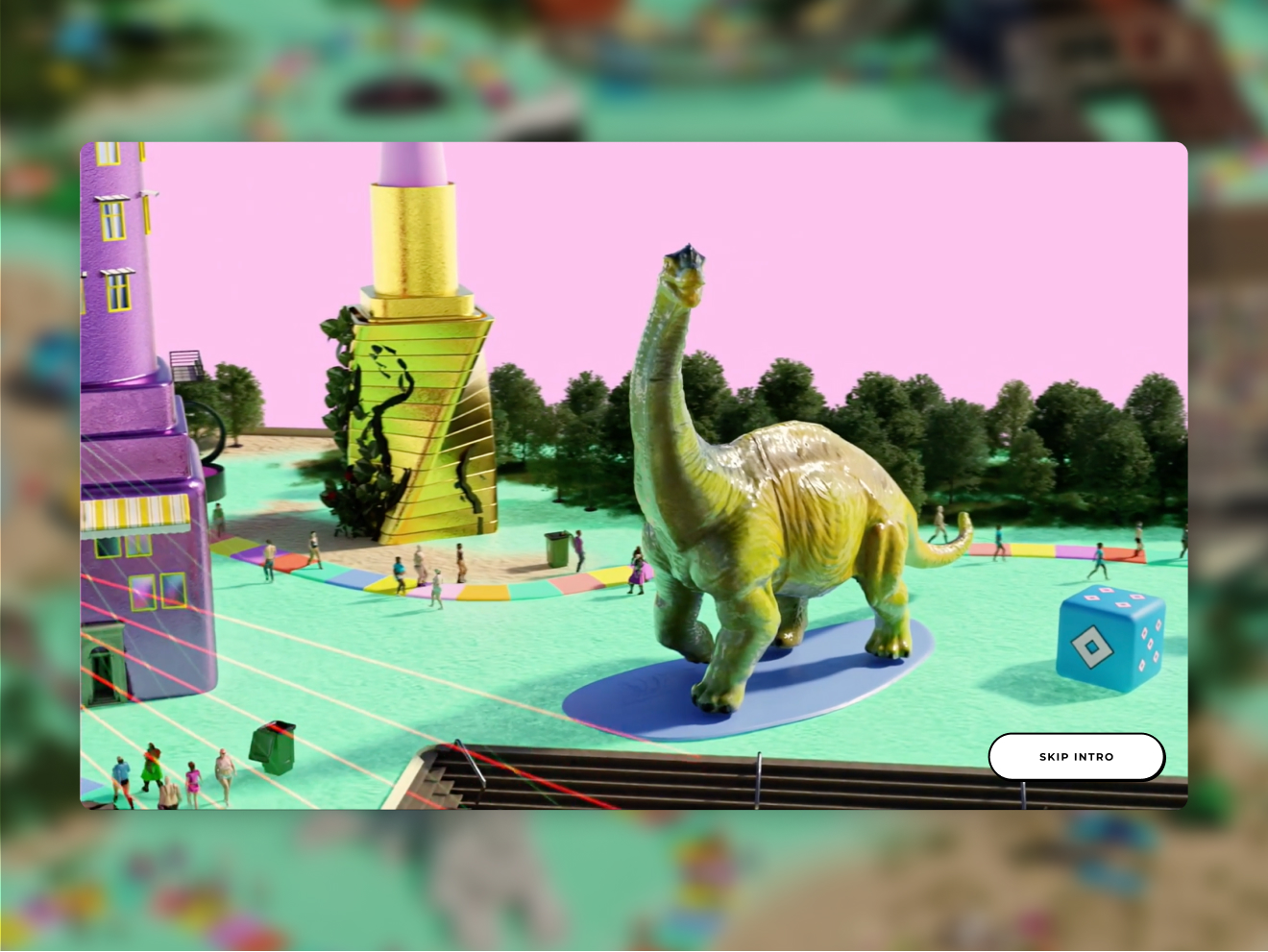
For the visual identity 2024 we decided to take inspiration from the childhood games of the ‘80s and ‘90s. Miniature models, plastic toys, the Rubik cube and iconic games such as Monopoly and Scrabble became the main inspiration of the new communication campaign.
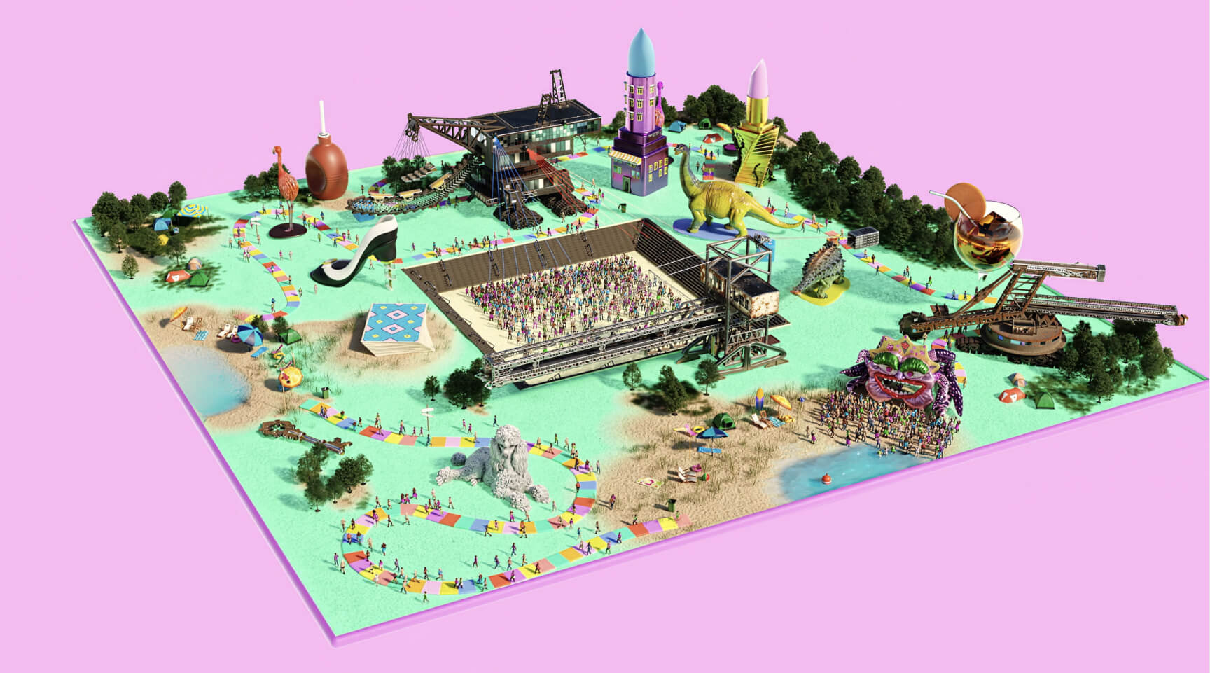
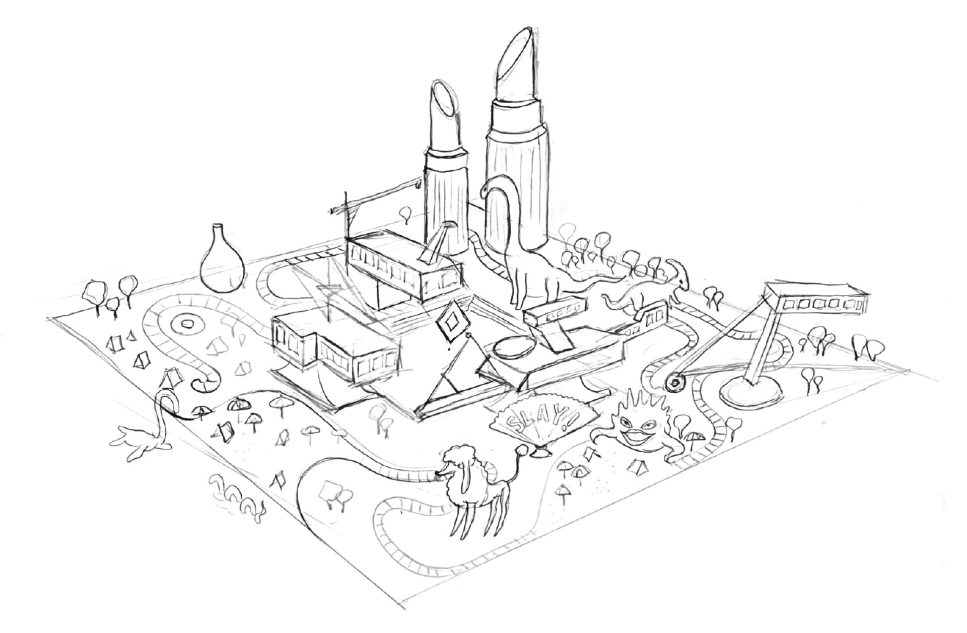
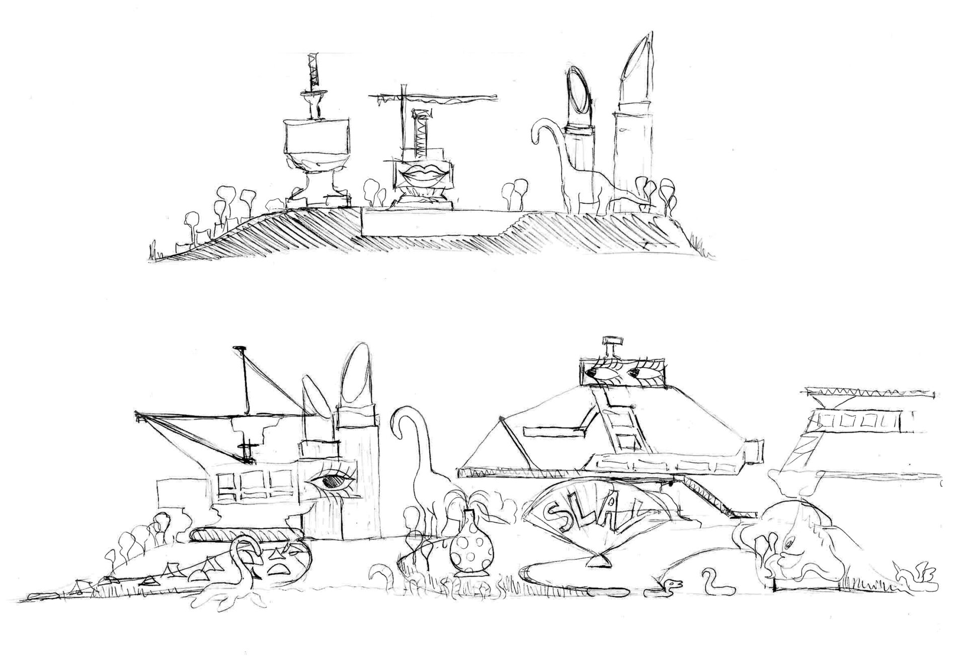
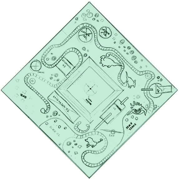
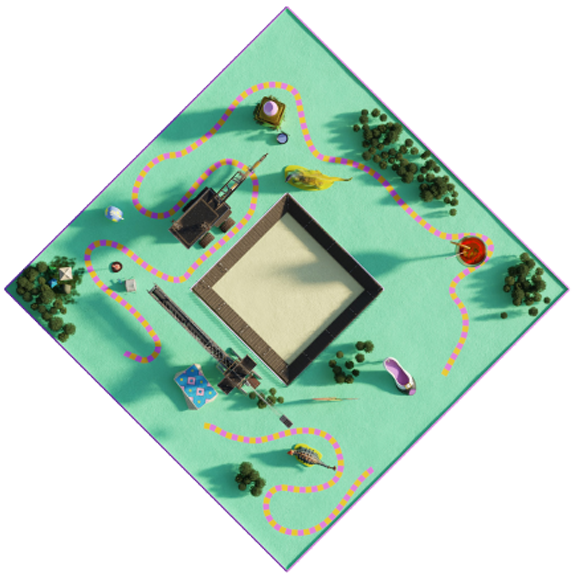
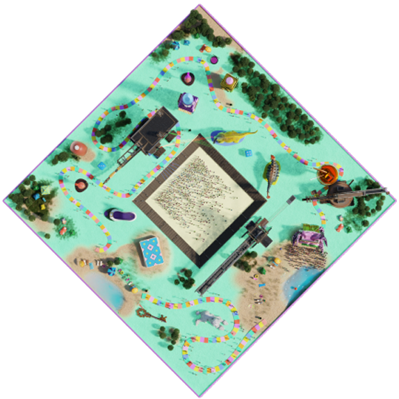
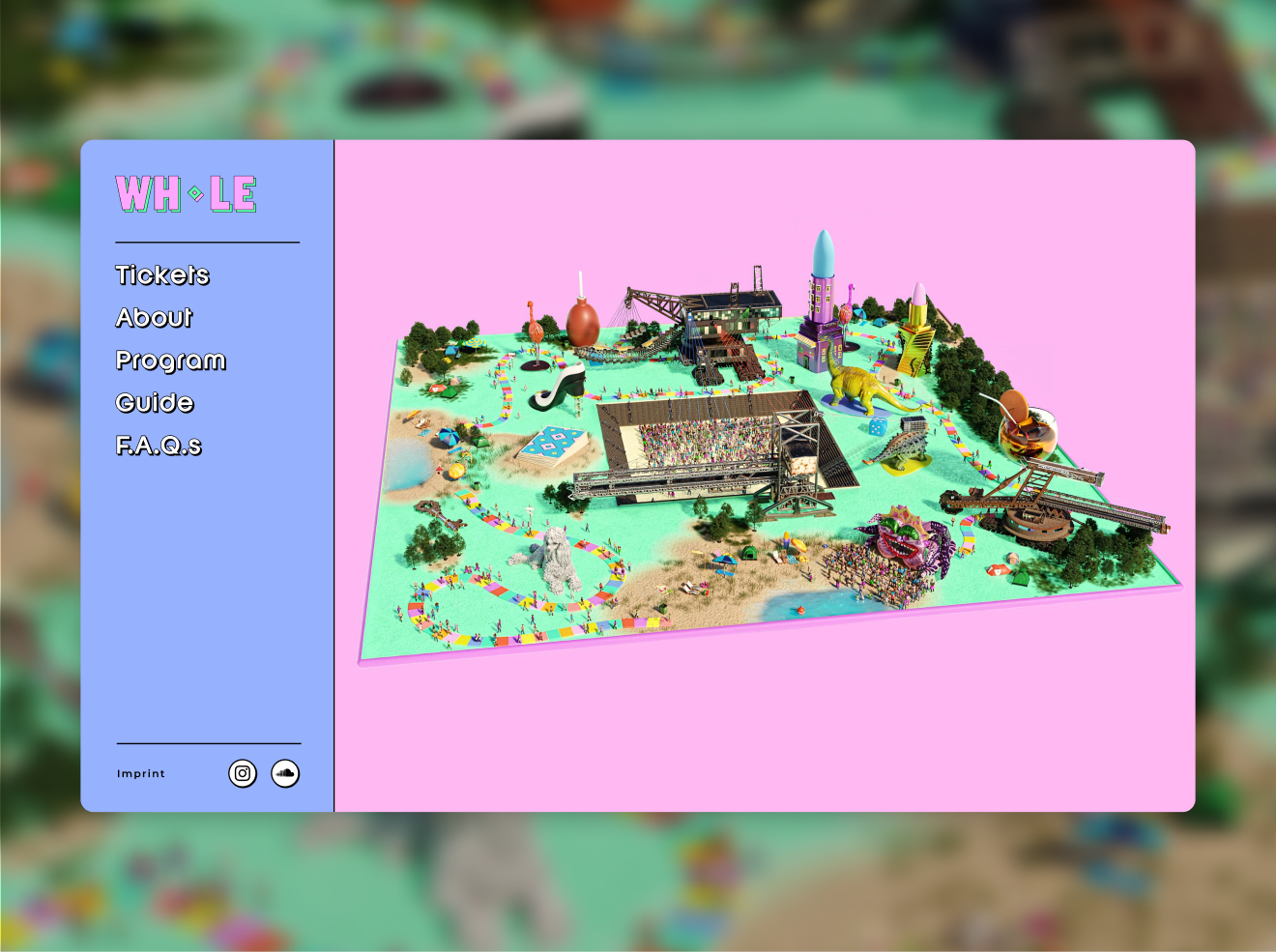
We went all out, imagining the festival site as this massive board game where everything is possible and it’s always time to play. The tagline “Shall we play?” worked as a reference to the gaming experience and yet as an invitation to join the festival journey.
Visual Guidelines
The new visual identity needed to be both accessible and intuitive, not only for the festival guests but also for the internal design team. Given the hectic rhythms of the communication campaign, the new visual guidelines had to be easily translatable into tangible design assets and yet maintain consistency with the storytelling behind the design.
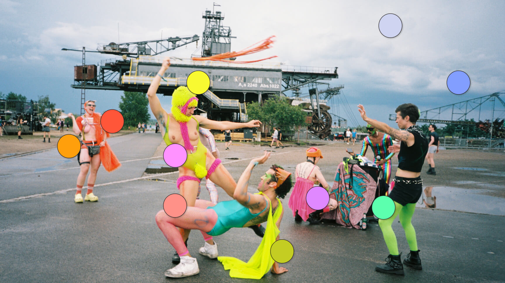
I developed a color palette that contrasted the natural tones of the festival site with the vibrant, fluorescent shades inspired by the guests’ outfits. Rather than relying on a single accent color, I opted for five equally distributed ones throughout the visual campaign. This decision was conceptually driven by a desire to create a welcoming a diverse environment, where everyone feels equally accepted.
The 3D Model
As soon as I began developing the new identity based on a board-game theme, I noticed a crucial similarity between the festival’s logomark—a perfect diamond—and the top view of a Monopoly board. I immediately knew that this strong connection should become the core element of the new identity project.
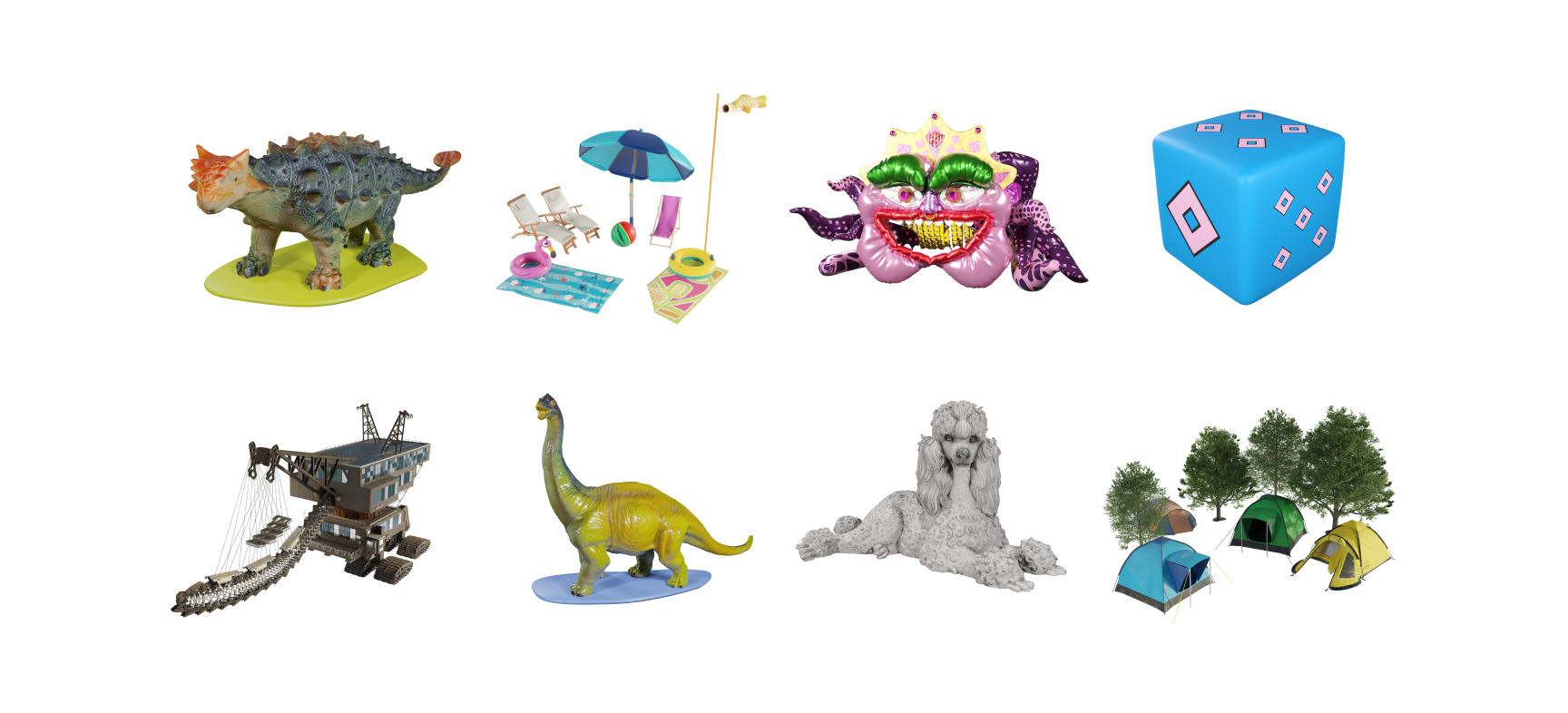
The festival’s diamond logo, which was the only design constraint, became the foundation for our custom game board, filled with tents, surreal creatures, Ferropolis’ iconic excavators, dinosaurs, and much more.
Visual treatment
and social media guidelines
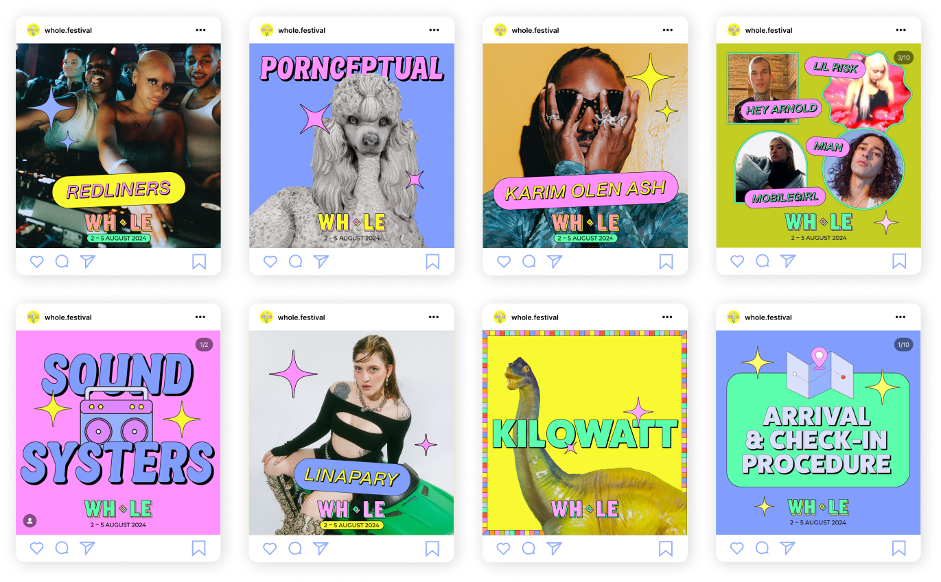
Based on insights from the previous edition, I identified two key objectives for the new communication strategy:
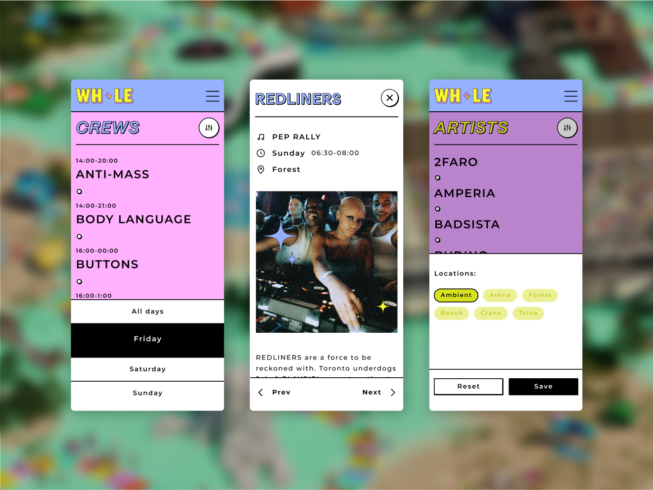
- Design a clear, straightforward layout for festival guests, enabling them to easily manage various pieces of information, such as the line-up, routes, practical instructions, program changes, and more.
- Create design templates for digital and print campaigns that are easy for the festival’s internal team to manage. This ensures quick production of graphic materials under tight deadlines while maintaining consistency throughout the communication campaign.
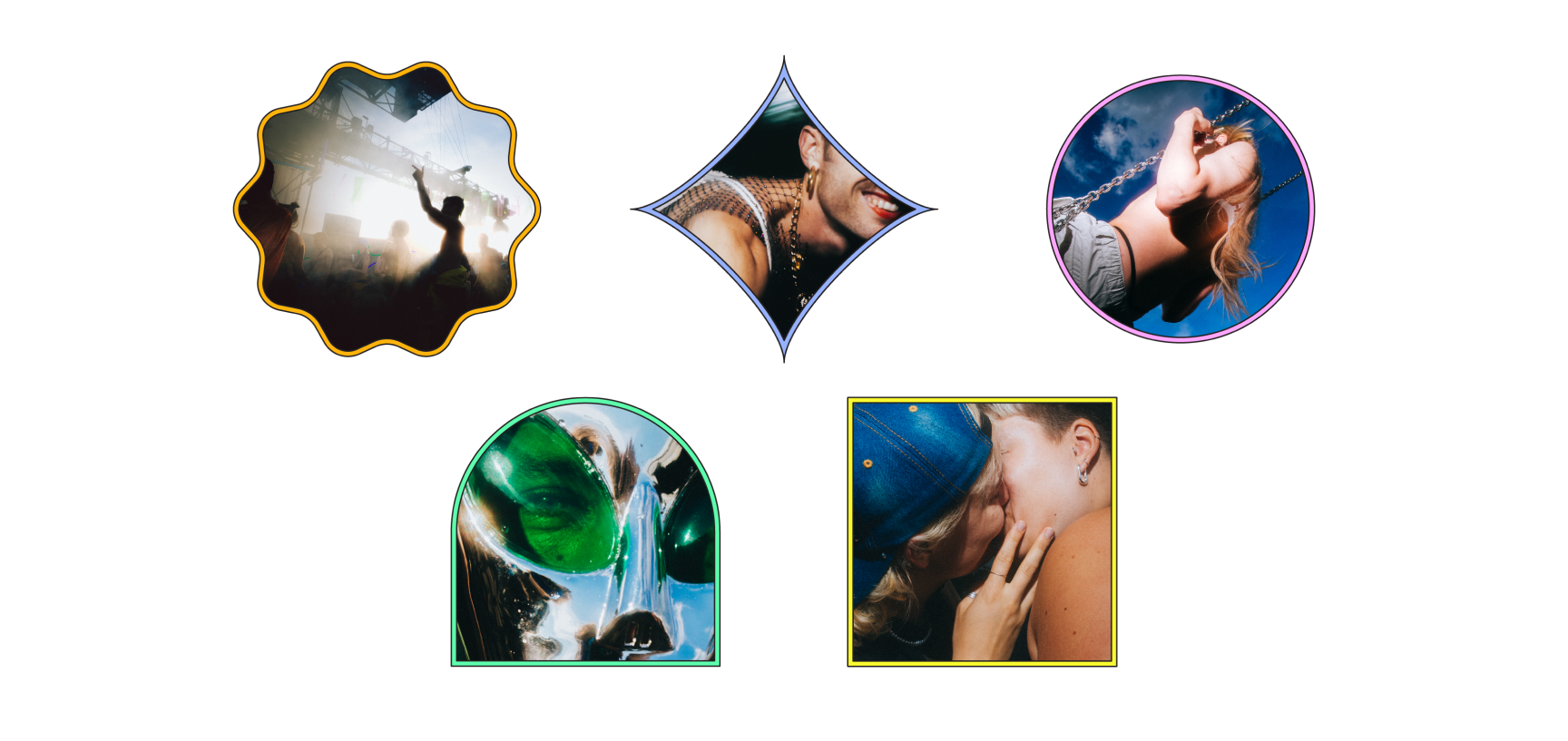
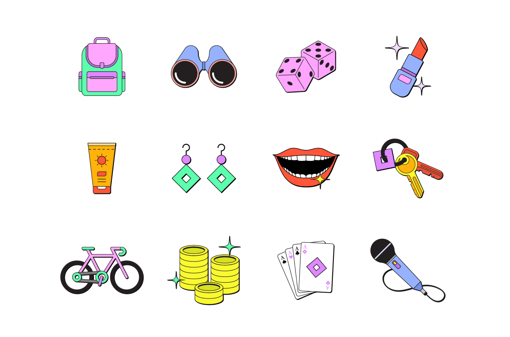
To achieve these goals, I created a mixed set of graphic assets that could be used and combined flexibly. The set included the 3D elements previously designed for the board game model, now exported as 2D graphics, the photos from past festival editions framed in various shapes and colours, and a series of 2D illustrations inspired by the festival experience that I personally designed.
Website Design
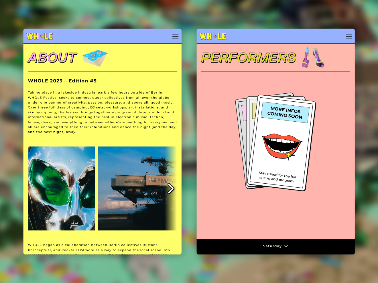
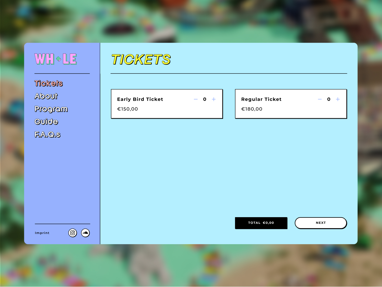
One of my main tasks for this project was to redesign the festival website to align with the storytelling of the new visual identity.
The new site needed to be user-friendly, showcasing the festival program and information while offering a real-time overview of the lineup during the festival; in addition to designing the main website, I collaborated with the Eventix team to seamlessly integrate their external ticket platform. To maintain the illusion of continuous navigation, we used an i-frame to replicate the main website’s menu design on the Eventix platform.
